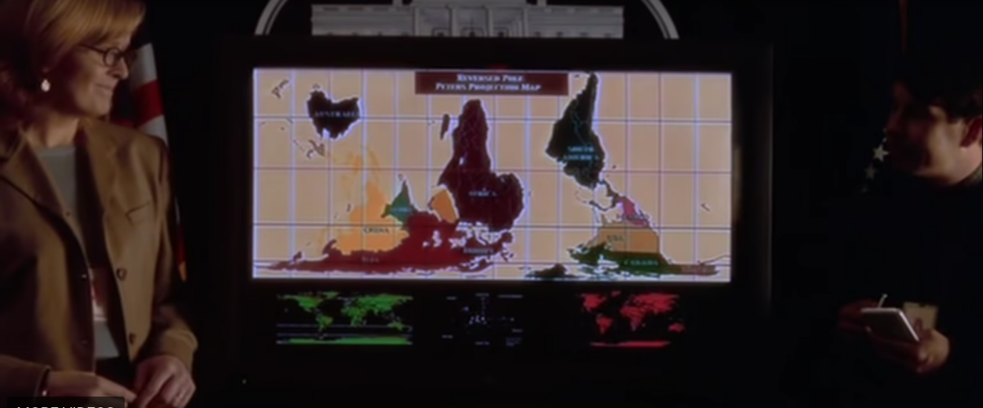
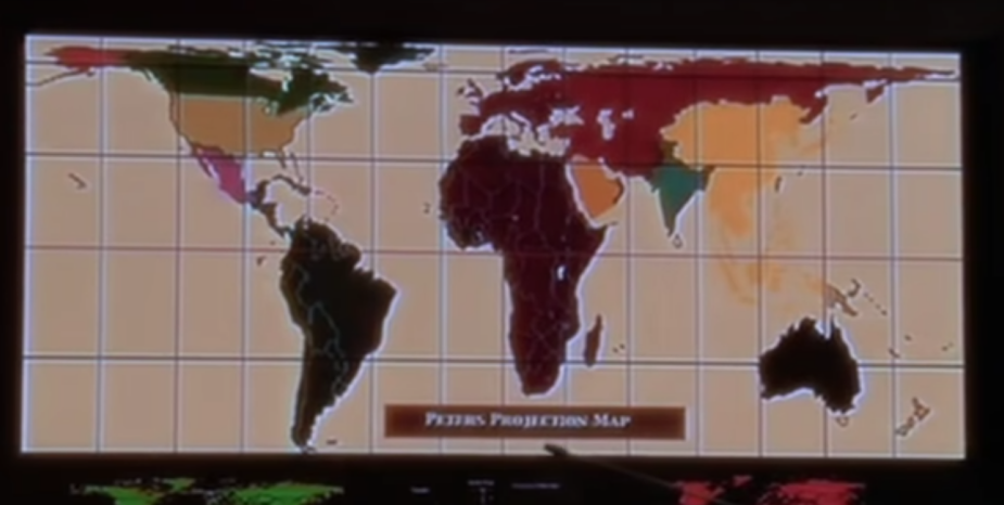
As anyone familiar with Aaron Sorkin’s West Wing knows, map projections are biased. In one episode of the West Wing, the fictitious Organization of Cartographers for Social Equality make the point that the commonly used Mercator map projection distorts the sizes of continents in favor of Europe and North America, essentially making the southern hemisphere continents seem much smaller than they actually are and presenting a eurocentric view of the world. They propose an alternate map projection: the Gall-Peters projection, which has an astonishingly detailed wikipedia page.
Changing Map Projections in R
Understanding and using different map projections is an important part of correct GIS analyses and visualization and is remarkably straight-forward in the sf+ggplot universe. Below are two ways to transform map projections in R:
#get map of countries via natural earthworld.poly <-ne_countries(returnclass ="sf")#first method: transform via sfworld.poly %>%st_transform(crs =4326) %>%ggplot() +geom_sf()+theme_minimal() +ggtitle("Change projection via st_transform")
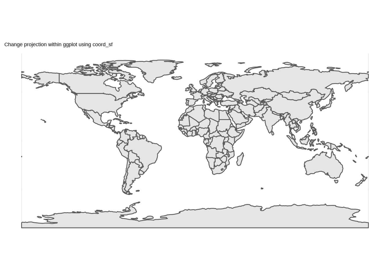
#second method: change crs of plotggplot() +geom_sf(data = world.poly) +theme_minimal() +coord_sf(crs =4326) +ggtitle("Change projection within ggplot using coord_sf")
They result in identical maps and which you use is up to you. Using the within ggplot coord_sf method is similar to projecting ‘on the fly’ in some GIS software. The projection is just being updated for the visualization but the underlying data projection remains unchanged.
Providing a coordinate reference system (CRS)
Either method takes one of the following arguments for the coordinate reference system (CRS):
object of class crs created via the st_crs function. This might be used if you wanted to match the CRS of another dataset, just calling st_crs(second_data) as the argument.
input string that st_crs can read. The format of this can vary widely. I most often reference a CRS using its EPSG number, as above. There is a database of all EPSG codes at epsg.io and you can even look up the most commonly used CRS for each country. This can then be provided in numeric (e.g. 3857) or a string format (e.g. “EPSG:3857”). Some common EPSG codes are:
EPSG
CRS Name
4326
WGS 84
3857
Web Mercator
4269
NAD83
6842
MODIS Sinusoidal
Sometimes there may not be a code for a certain CRS you want to use, or the code may not exist in the GDAL EPSG support files. Then you can provide a longer proj-string with specific information about things like the datum, ellipsoid, projection, true scales, etc. These are referred to as PROJ.4 strings in the EPSG database. For example, the full proj-string for WGS 84 (EPSG 4326) is +proj=longlat +datum=WGS84 +no_defs +type=crs.
Making the West Wing Map
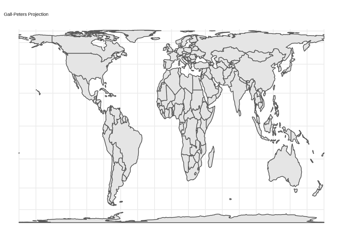
To make a global map in the Gall-Peters projection, we first need to find the EPSG code or proj-string. There is no EPSG code for this projection, but the custom CRS is described in this SO post. Then we can save this and provide it to coord_sf:
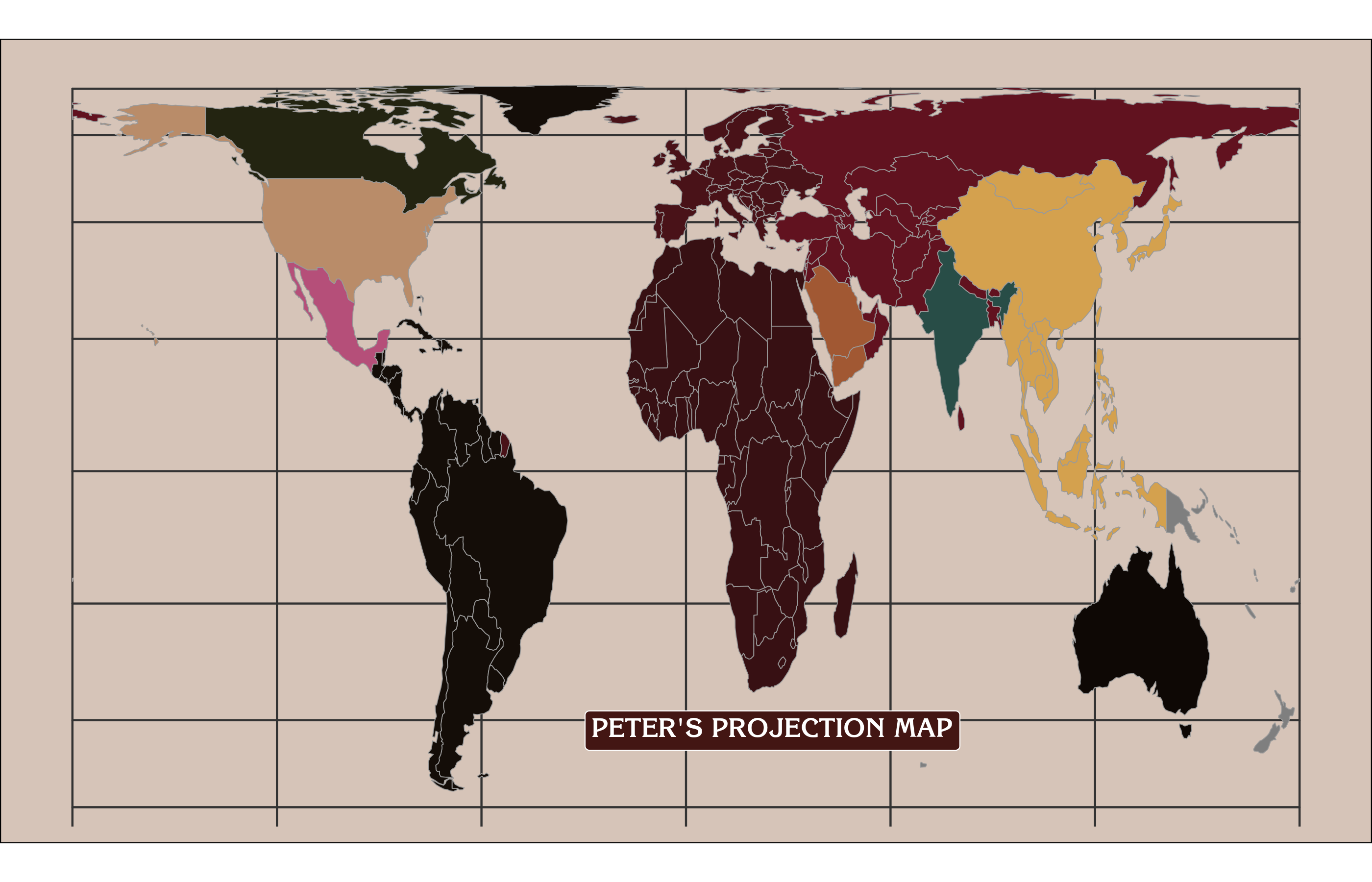
This works, but let’s see if we can’t make it more closely match the West Wing map. For that, we need to drop Antarctica and change some of the color palettes and fonts.